It is no breaking news that interactive content and kinetic email design have been ruling inboxes for quite some time now, especially after last year, when Gmail made AMP available on their platform. Apart from driving conversions and increasing open rates, kinetic, and interactive email designs entertain the viewers and enhance engagement.
As brands experiment and evolve in delivering amazing email content every day, there is no way to survive in the competitive industry by playing it safe.
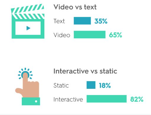
A survey by Kapost revealed that subscribers found interactive content not just better than static emails but even more enticing than videos, with 82% of them preferring kinetic and interactive content and only 65% preferring videos. Although it needs a lot of R&D to nail such emails, we are going to tell you why this art of emailing interactive content doesn’t end at just the concept and design.
Read on to find out as we serve you a large portion of facts and figures with a slice of the best interactive emails sent by various brands.
Things to Keep in Mind Before Designing a Kinetic or Interactive Email
Strategizing the concept and crafting the design and content for an email are undoubtedly the most important steps in email creation. But before you saddle up for that, remember that your email should not just be delivered but interacted with and should convert prospects to buyers.
For that to happen, there are a few essential aspects you should keep in mind.
Deliverability
Most of the email clients like Gmail, Outlook, Yahoo!, and AOL support interactive designs, which covers the majority of what most recipients would be using.
It is very important to provide fall-back layout options so that in case a kinetic email is not being supported by a specific client or the ESP you are using (Mailchimp, Pardot, Salesforce, etc.), the email does not go unread or provide a bad experience. For instance, one can give a static email option instead of a kinetic email for clients that don’t support such formats.
Renderability
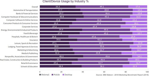
Along the same lines as deliverability, every marketer needs to remember that not all users use the same device to view the emails they send. However demanding and absurd it may sound, the success of an email is when each and every recipient, irrespective of what technology they use, should be able to receive the email, view it and act upon it. It is not just important to make an interactive HTML email but to make sure it is responsive and hassle-free to view on the subscriber’s device.
This shows the percentage of email users by each industry and what device they use.
Design
It might not seem fair to expect a custom email template like an interactive or kinetic email template to not be heavier, design-wise, than the simple text-based static emails. The purpose of an email is to deliver the brand’s message and to ensure the message drives the user to the desired action. So, you need to make sure that the elements that convey the main message and the CTA are always less heavy to load, even on a bad internet connection.
This way, the recipient will not miss the message of the email just because it took ages to load the heavy email design and it went past the 8-second attention of an average email user.
Types of Kinetic and Interactive email content
Basic
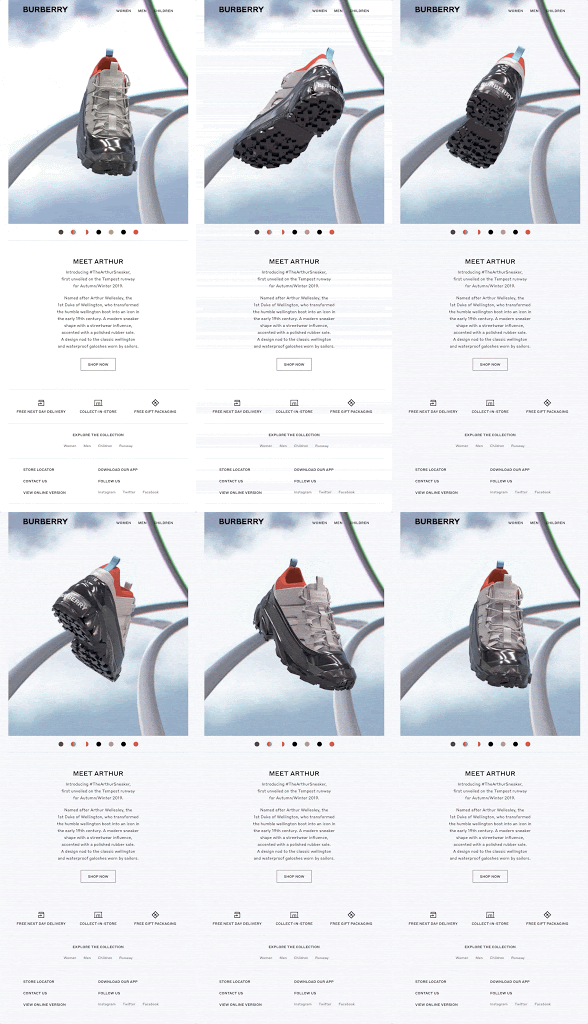
The basic kinetic email consists of CSS transitions, GIFs, or AMP backed by HTML5 to deliver the content in an email. It can be a carousel of images displaying various products or a GIF to grab their attention.
What better way to launch your product than in a 360-degree product display! Here’s a basic kinetic design by Burberry.
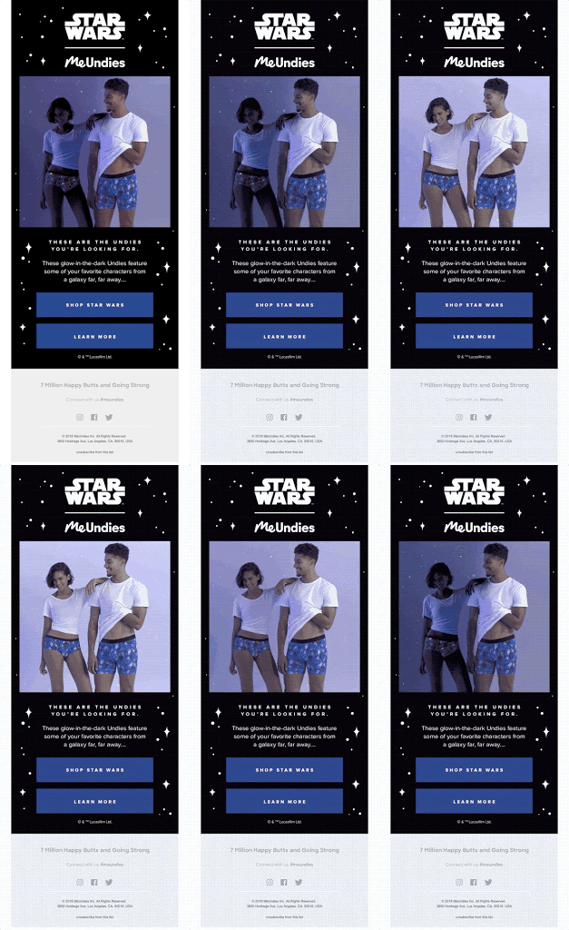
This email by MeUndies has used GIFs in the smartest way possible to highlight the USP of their product.
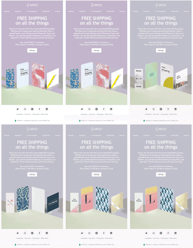
This email by MOO is telling its customers about free shipping on their products, but what they have subtly done is that they have exhibited their products in the GIF.
Kinetic effect

These types of emails use kinetic design to highlight or as effects in email design. Using CSS animation to enhance the look of the email and leading the viewer’s attention to the desired action, be it highlighting the CTA when hovering over it, blinking disco lights, or rollover to display various colors available for the same product and so on.
Here’s an example of a rollover tooltip used in a Nike email to describe products when hovered over them.
The original email
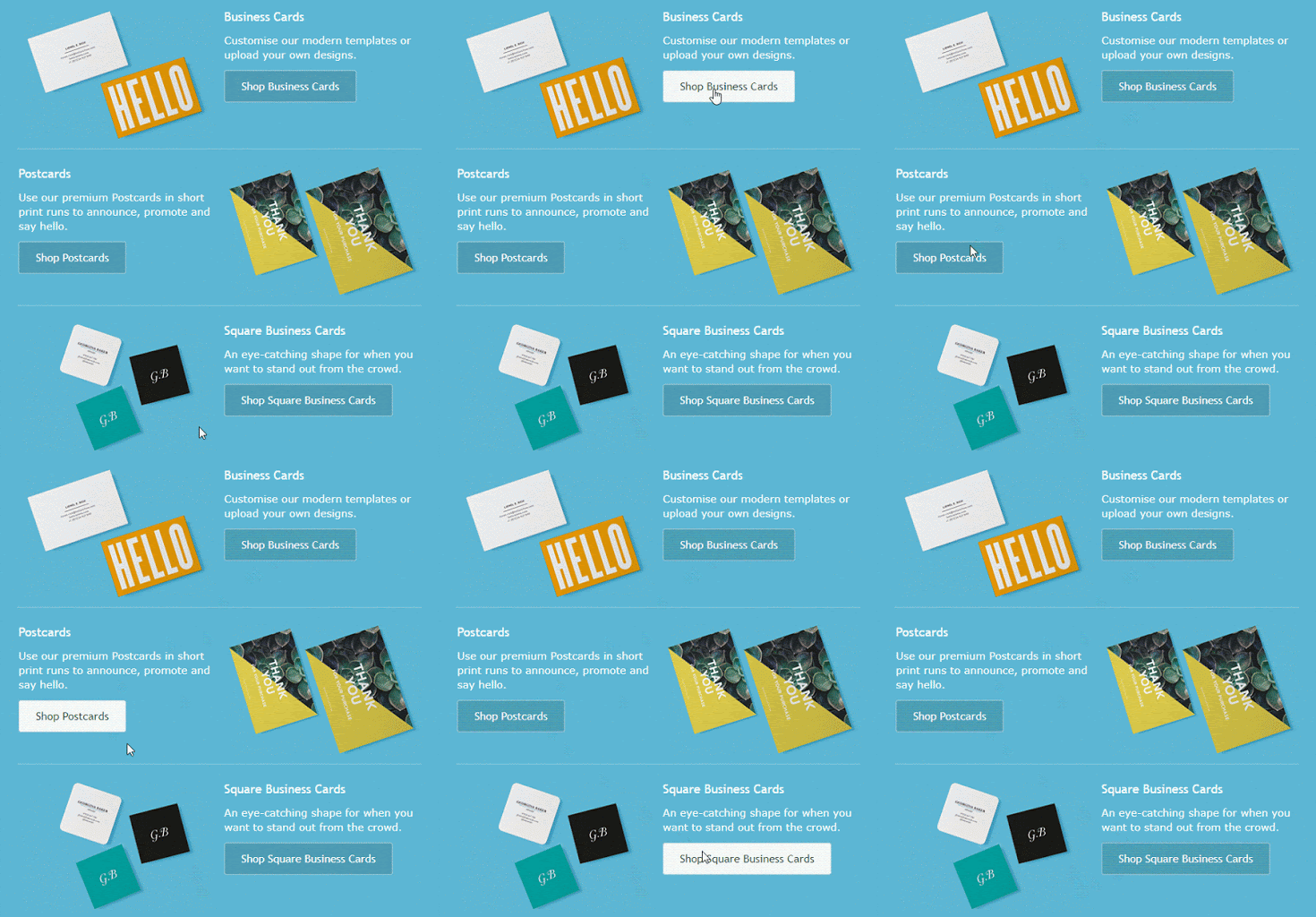
This next email has a hover CSS effect, which highlights the CTA when hovered upon.
Interactive kinetic
Anything from a drop-down or a collapsible menu to trigger-based interactivity in a kinetic email falls under this section. Using content and digital elements to entice the user to engage and respond accordingly with the design in an email is what makes interactive kinetic emails a huge success.
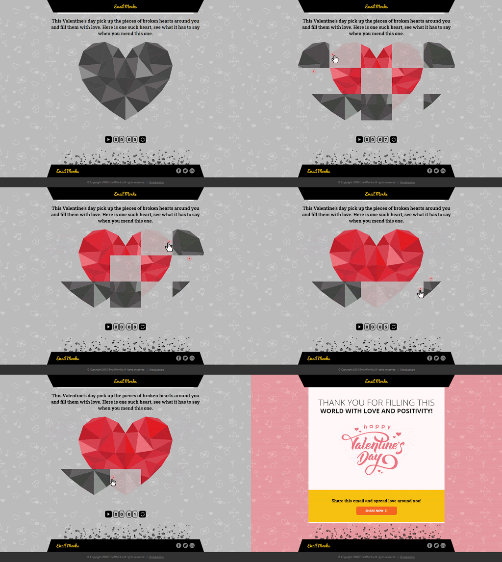
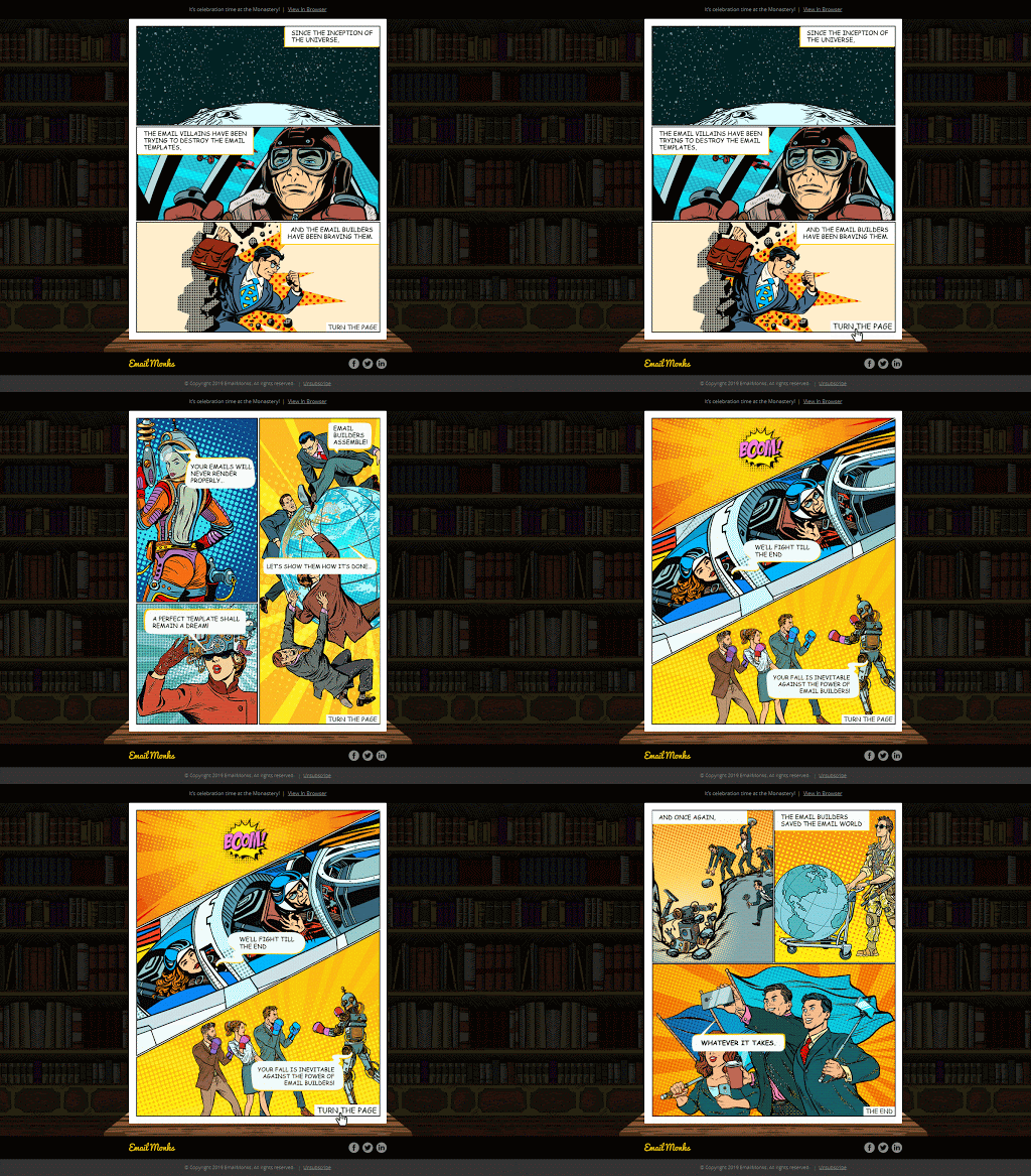
Check out these email template examples by Email Uplers, previously known as Email monks. They were sent on two different occasions. Each email holds a message of its own and shows the brand’s email design expertise.
Other forms of interactivity in the email include elements like forms, polls, quizzes, and surveys. These emails expect the subscriber to perform an action and engage with the email design. Through such content, you not only interact with the audience but you also get to know them and have access to first-hand data.
Best Practices
Make sure your design is supported in your subscriber’s device, if not, provide a fall-back alternative design for unsupported formats and devices.
Don’t use every interactive design in one email. You don’t need to prove to your subscriber that you are capable of creating interactive email designs. The most important goal is that you convey your message and use the kinetic email design to enhance engagement.
Including all sorts of interactivity elements like a scratch coupon, a game, or a poll would not only make the email graphic-heavy but it will also make the email layout look clustered.
Keep a single CTA, no matter how complex your design is. Giving your audience a lot of options would confuse them and might increase the time taken by them to make a buying decision. Have a straightforward CTA, of course, you can jazz it up with some kinetic design.
Provide options to skip a complex design. For instance, if there is a game in the email, give an option to skip the game, and get to the main message. So, if someone is not interested or has a weak internet connection, they wouldn’t be missing out on the information.
Don’t force a design-heavy email down your subscriber’s inbox.
Test Your Emails. Just because you have worked hard and everyone in your team is content with the email design, doesn’t mean it cannot be made better or is apt for your audience. So, make it a point to A/B test your email design.
This is not a practice to be followed with just kinetic or interactive design. Any process in email marketing should be tested, better if done multiple times.
Wrap Up
The greatest challenge for an email marketer is to make sure that the emails their brand send stand out in every inbox. Especially when your prospects are getting hundreds of emails every day, marketers need to up their email marketing game and stay ahead of their talented and driven counterparts.
After all, we see a better email every day that outsmarts emails from the previous day’s inbox. And you can do this by incorporating some kinetic and interactive email designs in your email campaigns but do so smartly.
 Hi Boox Popular Magazine 2024


