Amongst so much change, we all want our sites to have the latest features to ensure its success. From the increased popularity of immersive visuals and faster speed to algorithm updates and a higher relevance for mobile design and users’ experience (UX), things are moving on quite rapidly. More change means getting visitors turns harder…and we gotta catch them all!
In some measure, we have to give it a shot. How many opportunities do you have to convince first-time visitors to stay in your site, look through all the pages, and return in the future? You’re right, it’s only one shot. One opportunity.
You have to understand there’s also no secret formula anyone can prescribe to retain the attention of each and every single visitor. Nevertheless, these seven key elements can enhance your website’s chances to maintain your visitors happy, form a community, and meet the goals you set for your business.
1. Responsive Design

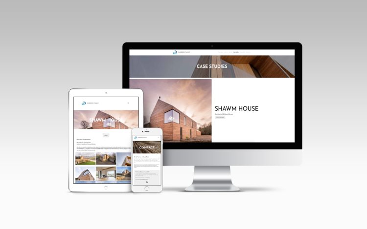
Responsive design has become crucial for everyone whose life is accompanied by a digital presence…so almost everybody in the world. We have smartphones and tablets all over the place, and for the last couple of years, there have been more mobile searches than desktop searches. We have to listen to the market, especially now that Google qualifies mobile- responding sites as a priority over those that are not fully optimized.
You might be doubting: “What is the responsive design exactly? And how does it affect my website?”
Well, it’s pretty simple. Responsive design is a feature that takes action when a designer builds a website that resizes itself according to the devices where the users are interacting with it. This features goal is to make sure that one site has multiple elements responding variously when viewed on laptops, computers, tablets, or smartphones.
The resizing process occurs by proportion rather than pixels. This way, the design allows the user experience to stay superb, securing the site’s usability and visual aspects, so visitors maintain their trust in you and what you have to offer.
This process is so vital that some of the more prestigious sites are turning mobile-responsive websites into their top priority. Gone are the days where desktop ruled. The mobile is the new king in town; therefore you have to get more trendy every single day,
2. Navigation
UX matters. Write it down and repeat it out loud as many times as you need to memorize it. UX, or user experience, matters. Visitors make their minds of your site’s navigation from the first second they interact with it. Is it easy to navigate? Is it neatly organized? How does the site communicate what it has to offer, and how deep can I go as a user?
All these questions flow throw users’ heads the moment they arrive. Therefore, your website must provide a clear answer to all of them at first sight. If you can wow your visitors and maintain their interest while keeping the site simple and only showing the most essential elements and categories, they might fall in love.
And yes, simplicity matters. Overstuffing your site can harm the navigation experience because users don’t like to feel tested in their first step. That is precisely why user-friendly texts are also crucial. If writing troubles you, don’t worry, you can always hire a copywriter to help you.
Another piece of advice I’d like to offer is this: you should always have a search bar. It’s the law. Users should be able to look for information without much effort. This helps them to avoid getting lost in the navigation, but…in case they do feel lost, it is more than ideal to link your logo back to the homepage.
3. Media

After many years of looking at stock images and video, the audience is learning to identify them. Unfortunately, visuals from stock don’t engage as much as real visuals of your business. Somehow, visitors know when it is genuinely your office, team, or product the one appearing on the screen. Users not only know this, but they also appreciate it way more because it’s authentic, honest. This is especially true when it comes to video, as everyone can tell, there’s more production value involved.
If you’re going to use stock images, try to do it from time to time. People are smart, and they don’t want to consume content that feels generic. Try to invest some money on a camera or on hiring someone else to make a photoshoot of your business. Perhaps even your artsy nephew could do it. There’s always someone!
Once you have the images, use them strategically to boost your content value and break the text visually. People who read 2000 words blog posts want to see at least a couple of pictures.
On the other hand, you would notice that media slows down your site performance. Thus, you should compress all your images and videos before loading them to your site to improve page speed.
4. Reviews and Testimonials
When we want to buy a product, service, or even date someone, we need to gather some proof it would work out. That’s why we love to read reviews and ask our friends about the person we are dating.
With testimonials, we form a sense of users’ personal experiences with the product. We infer the quality of the business when we identify ourselves with those leaving the reviews because they were in our same position, skeptical and yearning for answers, just moments before.
Testimonials are a great feature to add credibility and build trust in your website. It also helps create a community among people with similar interests. As these pages become a platform to show how your product benefits other people.
These reviews have a significant impact because they inspire users to give the final step and acquire the product while at the same time, providing unexpected insights. The audience could be telling you something that otherwise you would have never found out.
Of course, one central aspect is placement. Testimonials should not be a pop-up, nor the first headline…unless your product is being endorsed by the Queen. In that case, put it anywhere you want. The truth is testimonials should be displayed as smoothly as possible, so visitors don’t think of your website as annoying.
5. Social Media

Despite all its flaws, social media remains one of the most significant channels to communicate and engage with your audience. It allows communication efforts to be focused on a small targeted niche to boost their impact and accomplish goals.
Social media sites are fundamental for brand recognition and growth. If you’re not on social media, how could new users find you? How could you generate buzz? How else would you foster, feed, and maintain a community with your target audience? If you want your business to have loyal customers, social media is part of the answer.
In 2024 it’s imperative to link back to your social media profiles and add share buttons on every single content you publish with plugins such as AddToAny to complete the integration. This way, you get more likes and shares, which could transform into increased traffic of followers, subscribers, and buyers…which would eventually turn into more and more profit.
6. Facebook Messenger Chat Feature
Users visit business websites looking for answers. And what is a better way to find them than with a live-chat that attends your concerns in real-time? People all over the world enjoy the seamless Facebook Messenger Chat feature, a top-notch option to upgrade your business to the next level with recommendations, promotions, and customer service.
Wanna turn things up to eleven? Take it a step further and get MobileMonkey’s WP-Chatbot, which communicates in a user-friendly and natural language, 24/7, and is the premium way to add Messenger chat to your website. Get to know more about this plugin here: https://www.bestcloudtools.com/reviews/10-essential-wordpress-plugins-in-2019/.
7. Call-to-Action (CTA)

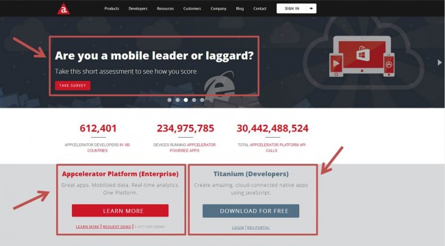
At last, let’s talk about call-to-action or CTA if you’re cool. CTA is a statement built to guide users to perform specific actions like buying a product, sharing a post, liking a picture, or subscribing to a newsletter.
A CTA should be clear and concise, without wandering and with the site itself functioning as one for visitors who are looking for contact information. This is why users should access effortlessly to elements such as your email, phone number, or social networks.
When constructing CTA, I’d suggest you think about the language and the colors you’ll employ, since different colors could trigger mixed emotions in potential buyers.
Let’s sum things up!
Technology is growing faster, while users are getting smarter and harder to attract. Thus, it remains crucial for website owners in 2024 and the years to come to fully comprehend and follow through with the trends they are expected to fulfill.
Even if there’s no single formula for it, visitors want updated, not outdated sites. And they know how to identify both of them quickly. All we can do now is learn from experience, if not yours,
from others. And just experience has taught me that responsive design, navigation, media, testimonials, social media, chats, and call-to-actions are the most essential elements to maintain a successful website.
 Hi Boox Popular Magazine 2024


