Brochures are some of the best ways that you can advertise your products or services, and if they are made the correct way, your customers will enjoy reading them. Designing a brochure is not very easy, and it takes some skill and practice before you’ll be able to do it right, but luckily we’re here to provide some free and helpful tips.
So, if you are a beginner in designing brochures, or you simply want to learn more out of curiosity, feel free to keep reading until the end. Let’s take a look.
Identifying the purpose of the brochure

When designing a brochure, you need to make sure what exactly will be the purpose of it. That’s the first thing you need to do because everything that you include as a visual on the brochure needs to be related to the content you’re advertising inside it.
For example, if you are advertising food, the brochure should include colors that induce hunger, such as yellow and red, and pictures of well-prepared meals which will encourage the reader to order something from your menu.
We have tons of examples for this, but we’ll keep it short since we believe you’ve already understood what our point is. Just remember to design the brochure in a way that will intrigue everyone who’s reading it.
Don’t make it too promotional

When it comes to advertising your products, it is quite understandable to include all of the positive sides and benefits of using them. However, no matter what it is that we’re talking about, it will always have a few downsides as well, and if you’re a humble and honest manufacturer, you should mention at least a few of them.
People will appreciate your honesty and you will earn a few extra points in their eyes by doing this, as opposed to if they find out about the downsides of the product by themselves after purchasing it, which can only make them frustrated.
You can advertise your products as some of the best ones out there on the market, but don’t include any unrealistic things that the actual product cannot achieve. If you get your customer’s expectations too high, the disappointment will be larger when they purchase your product, even if it meets all of the standards, simply because you made them expect much more than that.
Maximize efficiency
Making a brochure costs money, and since every business is about making money, you need to make sure that each investment is bringing you more than you’re spending. This means that when you’re creating a brochure, you’ll need to maximize the efficiency, and use every piece of paper that you’re paying for.
This doesn’t mean overloading your customers with useless information, but trying to mention as many products as you can and briefly describe each one of them, making your customers intrigued to find out more about it, suggests QINPrinting.com.
Feel free to include any links to your website or customer support contact from your service just in case your readers want to acquire more information or make a purchase.
Choose an attractive font

The visual aspect of every brochure is very important, so choosing a font might not be as easy as you think. Here’s why. If you have a product description for every item in your brochure, it means that the people who read it have a lot to go through. This means that if your font is not very easy and pleasant to read, you will frustrate your potential customers and do more harm than good.
Make sure that you choose a font that both looks good and matches the style of the brochure, that’s also easy to read at the same time.
Pay attention to colors

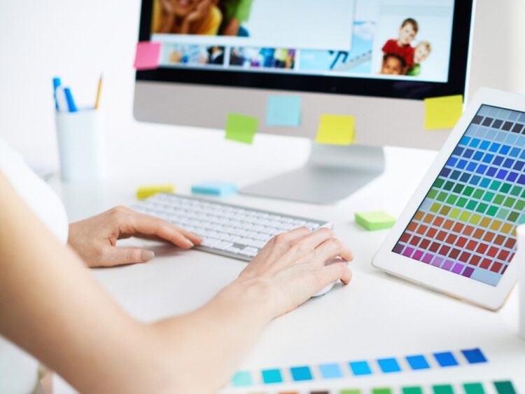
A brochure needs to be pleasing to the eye of your customer because nobody likes to spend time looking at something that has all sorts of different colors that are not matching themselves at all. Make sure that the colors you choose both for the font and the photos of your products are in co-relation with each other.
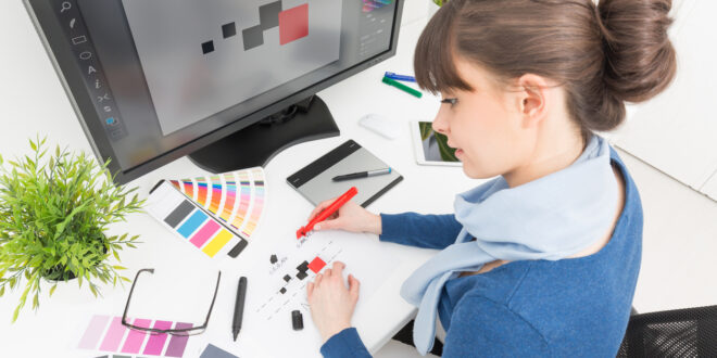
You can use a free online color matching service to see which colors are adequate with each other, or you can try to listen to your intuition, but the risk for making a mistake is higher this way. Consulting with a professional designer is your best bet, so if you’re serious about making a mind-blowing brochure, make sure you do that.
How it “feels,” tells a lot about your brand

There’s a reason why some of the top-tier brands are not creating brochures out of the regular paper that’s used for notebooks or anything similar. Using a high-quality processed paper, sometimes even thicker than the regular sheet is very important. If your brochure feels top-quality, your customers will know that your products are top-quality as well.
Don’t cheap out on anything related to marketing, especially not on brochures, since they’re one of the key factors when it comes to how much you’re going to sell.
Choose a high-quality paper, preferably with an interesting texture, and we guarantee that the readers will be completely satisfied with it.
Don’t overcomplicate it – Keep it simple

Nobody has the time to read a brochure that’s longer than a book these days, so when you’re designing yours, make sure to keep your statements as simple and concise as possible. Simple ideas are always the best ideas, so even if you need to write product descriptions for every item that you include, make sure to use as few words as possible. People will appreciate this.
Also, when it comes to the pictures with instructions or anything similar that you want to include, make sure that those are simple as well. Don’t over-explain your products, and leave some curiosity in the people who might want to make a purchase.
The first impression matters a lot
The front page of your brochure is what will decide if people are going to open it or not. It sounds a little bit harsh, but it’s true. You can have the best content inside, but if your front page is not attractive, people won’t feel the need to pick up your brochure. Invest carefully in the design and make sure that it’s as aesthetically pleasing as it is effective.
 Hi Boox Popular Magazine 2024


