Just like with any other type of creative discipline, web design is going to have some specific rules that you should follow. You need to make content, visuals, and navigation work together to help get the perfect balance.
But whether you work at a web design agency or freelance from home, it is important to know how to put all of these things together. But how do you approach some of the foundations of good website design? Some of the effective web design principles every designer needs to know include:
1. Have Good Content

Creating good content should be one of the first things you consider on your website. All the content that you place on your website needs to be relevant and useful for the customer. This makes it more likely that you will rank with SEO and can keep the visitor on the page for longer.
When creating content, make it engaging and useful. A few keywords to help with SEO can be fine, but make sure they fit naturally into the information and that keyword stuffing does not happen. This will make you rank lower in SEO.
Remember that many of your visitors are going to come to you through their smartphones or another mobile device. Having large chunks of paragraphs and text can be difficult to manage on these devices.
There are a few things that you can do to help. keep the paragraphs down to just a few lines at a time to make it not look so big and bulky. Dividing up the content with some relevant pictures will help with this issue as well.
2. Engage the User with Visuals

Your website needs to have relevant visuals throughout it as well. While you do not want to add images just to have them there and you do need to limit them a little to avoid slowing down the website, a few images placed strategically around the page can help.
These images make the page more interesting. Your visitors are going to get bored if they come to the page and only see a lot of copies. It also helps to break up the content to enhance the flow of information. Depending on what is on your website, these images can help to explain the topic when used along with the content.
3. What Type of Typography to Use

Not only is the content important on your page, but you also need to consider the design of the letters as well. Simple is often better here unless a more elegant or fun script goes along with what you sell or provide to the customer.
Remember that your viewer is going to see the website on some kind of device, either their computer, a tablet, or a smartphone. Things appear differently on a screen than they do on print so you need to keep this in mind when creating the design on the website.
Be careful about the color of the background versus the color of the print that you use on the page. It is easy to forget how it will look when added to the website. If the typography is hard to read against the background, it is going to turn potential customers away.
After choosing the script that you would like to use, put it on top of the background and see how it looks. Do the colors clash too much? Is it too hard to read? You may want to consider getting a few different opinions along with yours to figure out what type will look the best and draw customers to the page.
4. Remember the Navigation

Website navigation is important when it comes to keeping viewers on your page rather than clicking off and picking one of your competitors for their needs. You need to make the navigation as simple as possible to enhance the experience for your visitors.
94% of people say easy navigation is considered one of the most useful features of a website. This allows the visitor to find what they need quickly and easily. And many of your visitors are going to be impatient when they are on your website. If it takes too long to find the information they need or the page takes too long to load, they will click out and find information elsewhere.
Navigation is one of the important parts that come with how well the website works and the user experience. There are different things to consider when coming up with the navigation on your website, but the point is that things should be organized.
Set up the website in a way that makes sense for the user. They should be able to find the tabs and information they need in just a few seconds. And the web pages should load up quickly with no issues to help customers out.
5. The Use of Color

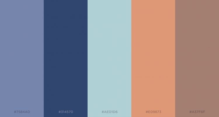
Just like with the visuals, you need to think through the colors that you would like to use on the page as well. The right use of colors will really draw the person in and help them stay on the page for longer.
You need to choose your colors wisely. A good place to start is to look at which colors are already associated with you. Your logo can give some good hints here. Tying the whole thing in with the colors of the logo can really give a more cohesive look to the whole thing.
If you already have some marketing materials available for customers, then utilize some of those colors in the web design as well. This can help keep everything organized and coherent so you make a bigger splash as well. Finally, don’t forget to make sure your website is ADA compliant for the disabled. ADA compliance refers to ensuring that a website is accessible to individuals with disabilities, in accordance with the Americans with Disabilities Act (ADA) regulations. This involves incorporating design features, such as alt-text for images, keyboard navigation compatibility, and clear language for screen readers, to provide an inclusive browsing experience for all users. By being ADA compliant, the website aims to remove barriers and make its content and services available to a broader range of individuals, including those with visual, auditory, motor, or cognitive impairments.
Making the Perfect Web Design Each Time
By following the principles of web design that we discussed above, you will be able to make perfect websites that are effective and that your customers are sure to love. With some practice and hard work, you will master them and love the websites that you can create too.
 Hi Boox Popular Magazine 2024


